Forty years of building something the world relies on. Tally came to us not to abandon that legacy but to carry it forward. The brief was to take a new set of values and make them real. Not words in a handbook. Not a poster on a wall. A living, breathing culture that every person in the organisation could feel, own and act on every single day.

FOUR DECADES. FOUR NEW VALUES.
Tally had always been guided by principle. Honesty and integrity. The power of simplicity. A continuous pursuit of excellence. The belief that their strength was their people. These weren't just corporate values. They were the founder's philosophy made operational. But after forty years, it was time to evolve. The new values distilled everything Tally stood for into four words. Honour. Nurture. Master. Create. Simpler. Sharper. Built for the era ahead. Our job was to make sure every person in the organisation didn't just know them. They lived them.
WORDS INTO BEHAVIOUR.
Design the new value system. Transform it from something people read into something people practice.
START WHERE IT BEGAN.
Tally's philosophy has always been built around care. A culture that stems directly from founder Shyam Sunder Goenka. A man who believed that business existed to empower people, not just generate profit. That belief is captured in the most unlikely of places. The Tally logo. Hand-drawn by the founder himself. In a world of sleek, impersonal tech identities, it stands as something rare. A mark of genuine human warmth. That's where we started. Not with a brief. With a signature.
ROOTED IN HERITAGE. READY FOR WHAT'S NEXT.
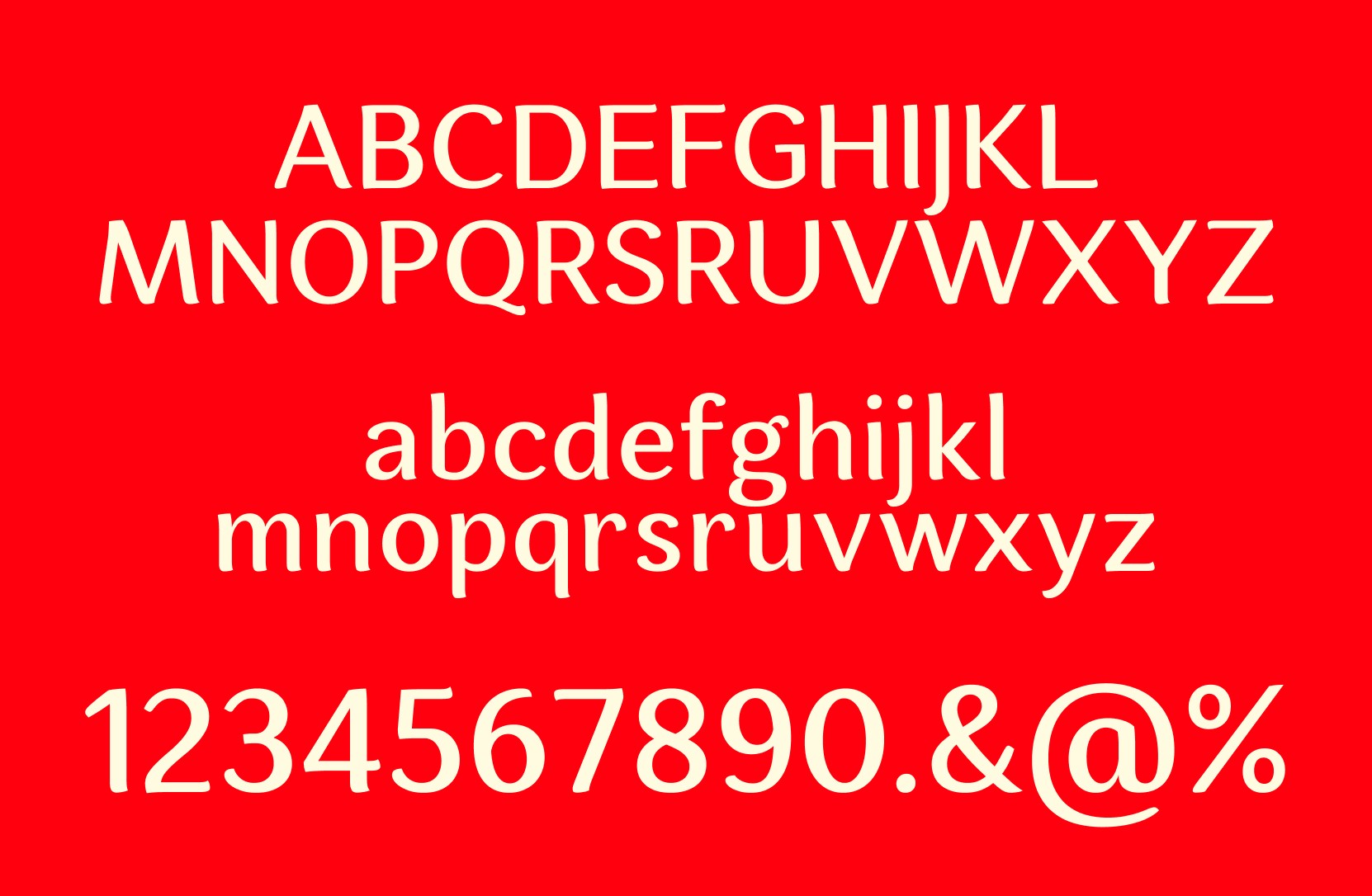
Black and red. Forty years of trust carried in two colours. We didn't change them. We deepened them. Espuma Pro for headlines that carry the confidence of an industry leader. Roboto for the warmth and accessibility of a company that has always put people first. Hand-drawn textures and raster illustration to keep the founder's spirit alive in every frame.


A SYSTEM THAT LIVED IN EVERY ROOM.
Each value got its own visual personality through raster-style illustrations rooted in Tally's black and red. Honour looked different from Nurture. Master looked different from Create. Because each value demanded its own story. That visual language then travelled everywhere. A detailed booklet so every employee could absorb what each value truly meant. Posters and wall art that turned office spaces into daily reminders. Merchandise that made the values personal, tangible and impossible to ignore.
FROM CAFETERIA TO CONVERSATION.
Honour. Nurture. Master. Create. These four words now occupied every space in the organisation. Not as slogans. As standards. The illustrations gave each value a face and a feeling. Employees didn't just read the new values. They recognised themselves in them. Pride returned. Culture shifted. And a forty year old company walked into its next chapter feeling exactly like itself, only more so.