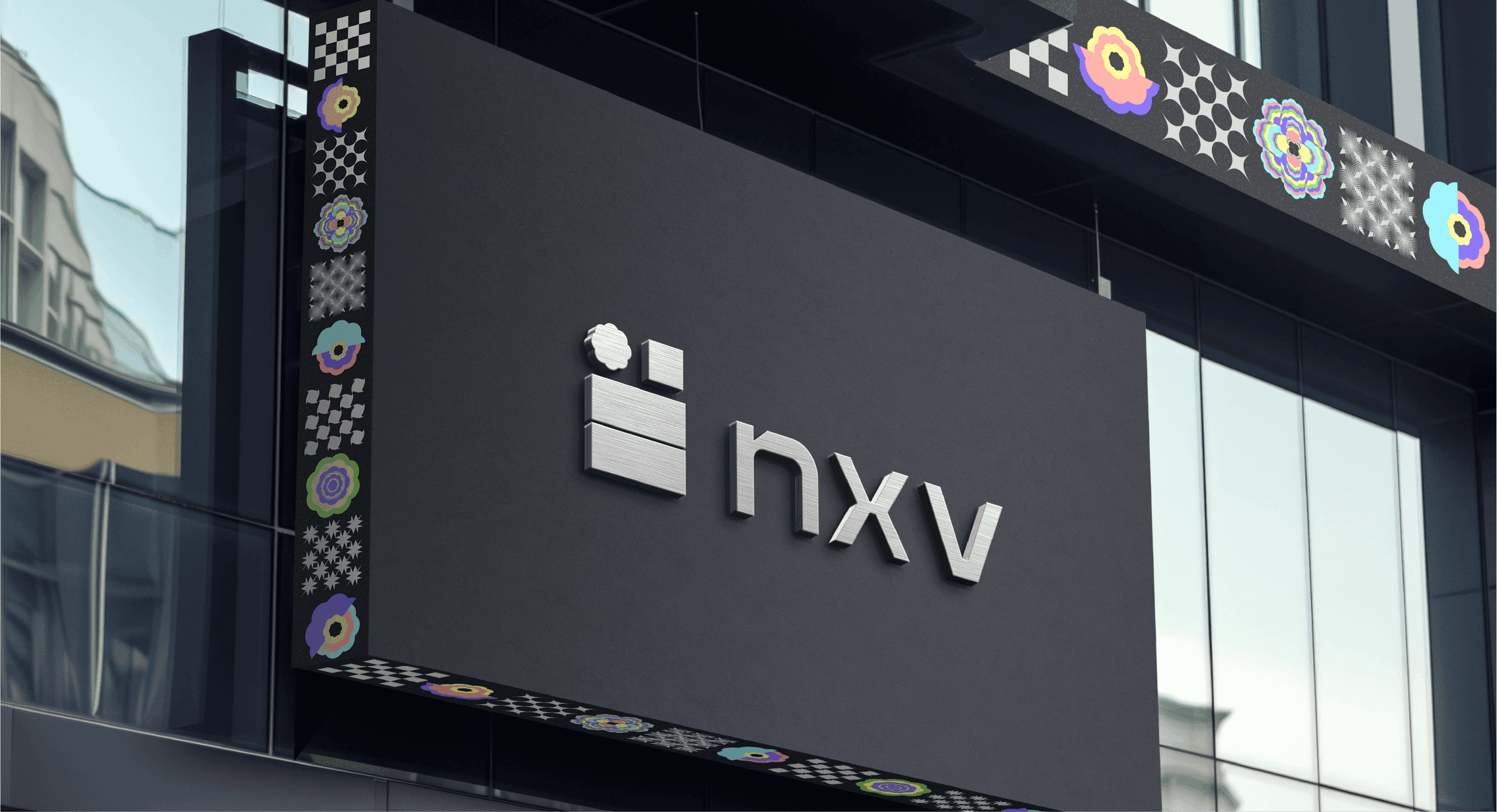
Nexverse.ai disrupts the ad-tech category by prioritizing human relevance over cold automation. While competitors optimize for efficiency, Nexverse focuses on emotional intelligence and intuition. Its branding—merging "brain and chip"—reflects a unique positioning: human-AI symbiosis. By augmenting creativity with precision, it offers a solution where technology and human emotion work in harmony to cut through digital noise.
Ad-tech fell in love with automation and forgot abouthumans. Advertisers bleed budgets on irrelevant placements. Publishers watch revenue leak. Consumers drown in noise that barely qualifies as communication. Everyone optimised for efficiency. No one optimised for giving a damn. Nexverse, a network exchange by Verse Innovation, needed to break from this broken category.
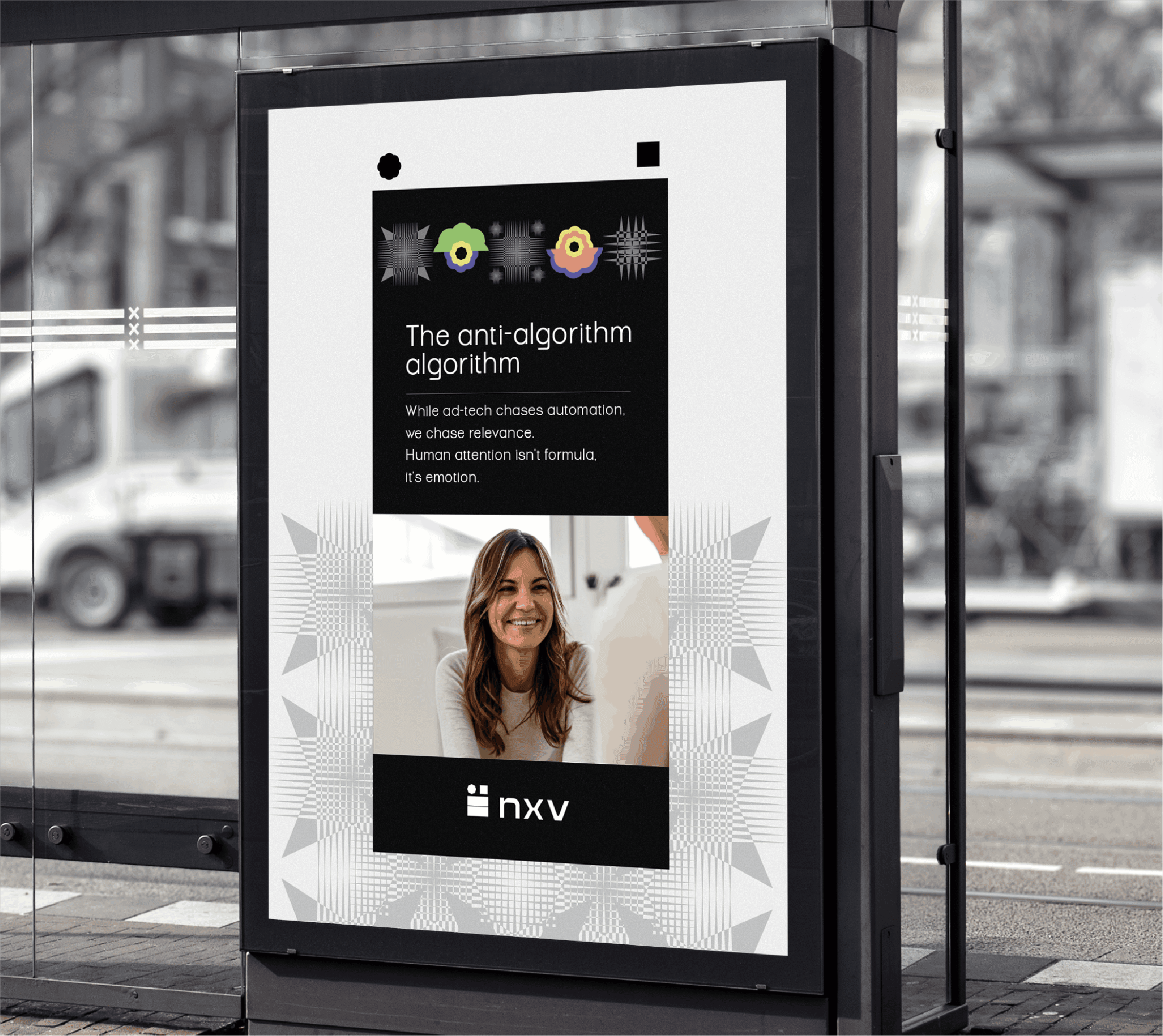
While competitors chased perfect algorithms, Nexverse.ai chased perfect relevance.Their insight: human attention isn't formula, it's an emotion.And emotions can't beautomated; they can only be understood.
Neural pathways embrace circuit geometry in perfect harmony. The organic dances with the systematic. Where human intuition flows into AI precision, creating something neither could achieve alone.
The symbiotic partnership between Human Ingenuity and Artificial Intelligence


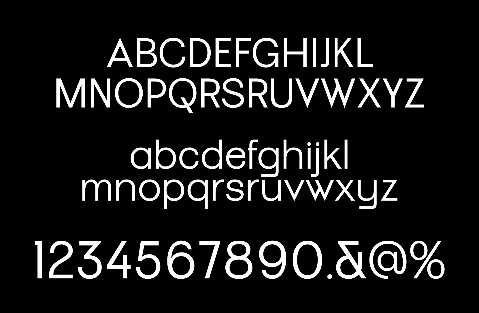

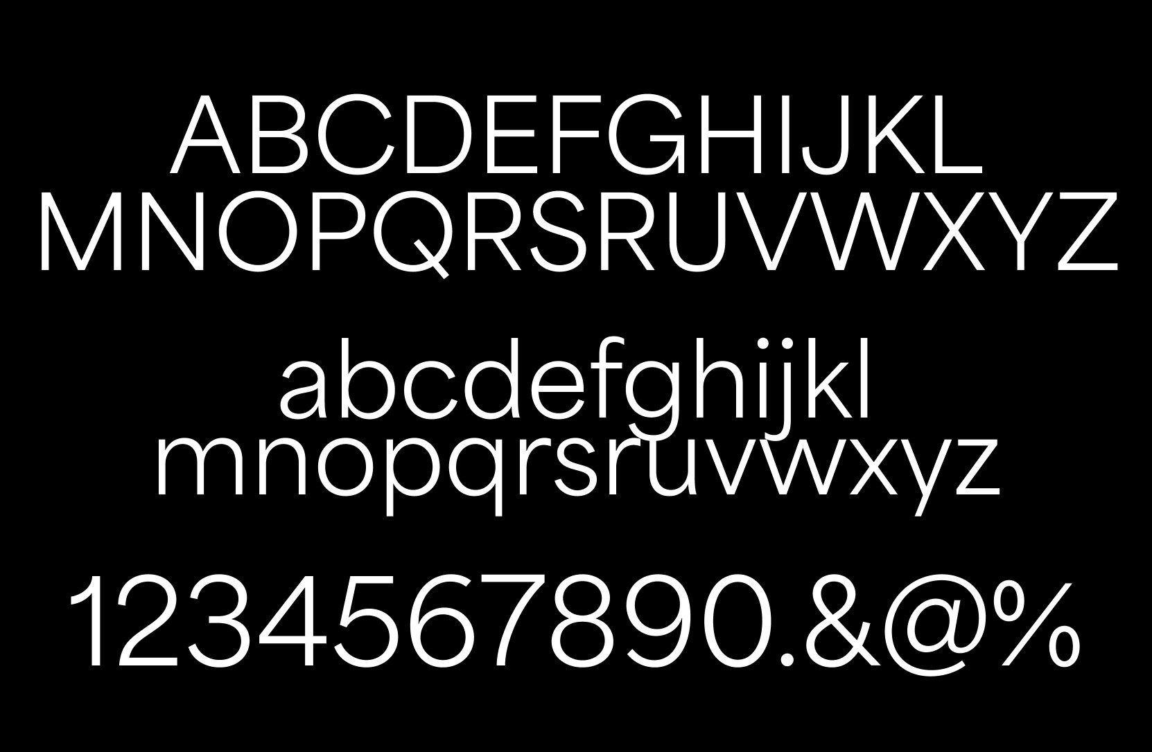
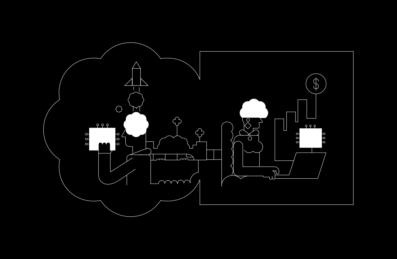
From the brain, where dreams begin, comes the Octacircle. From the microchip where possibilities multiply, comes the square. Together they create a visual language that speaks fluent human and fluent machine, celebrating the beautiful collision of creativity and logic.
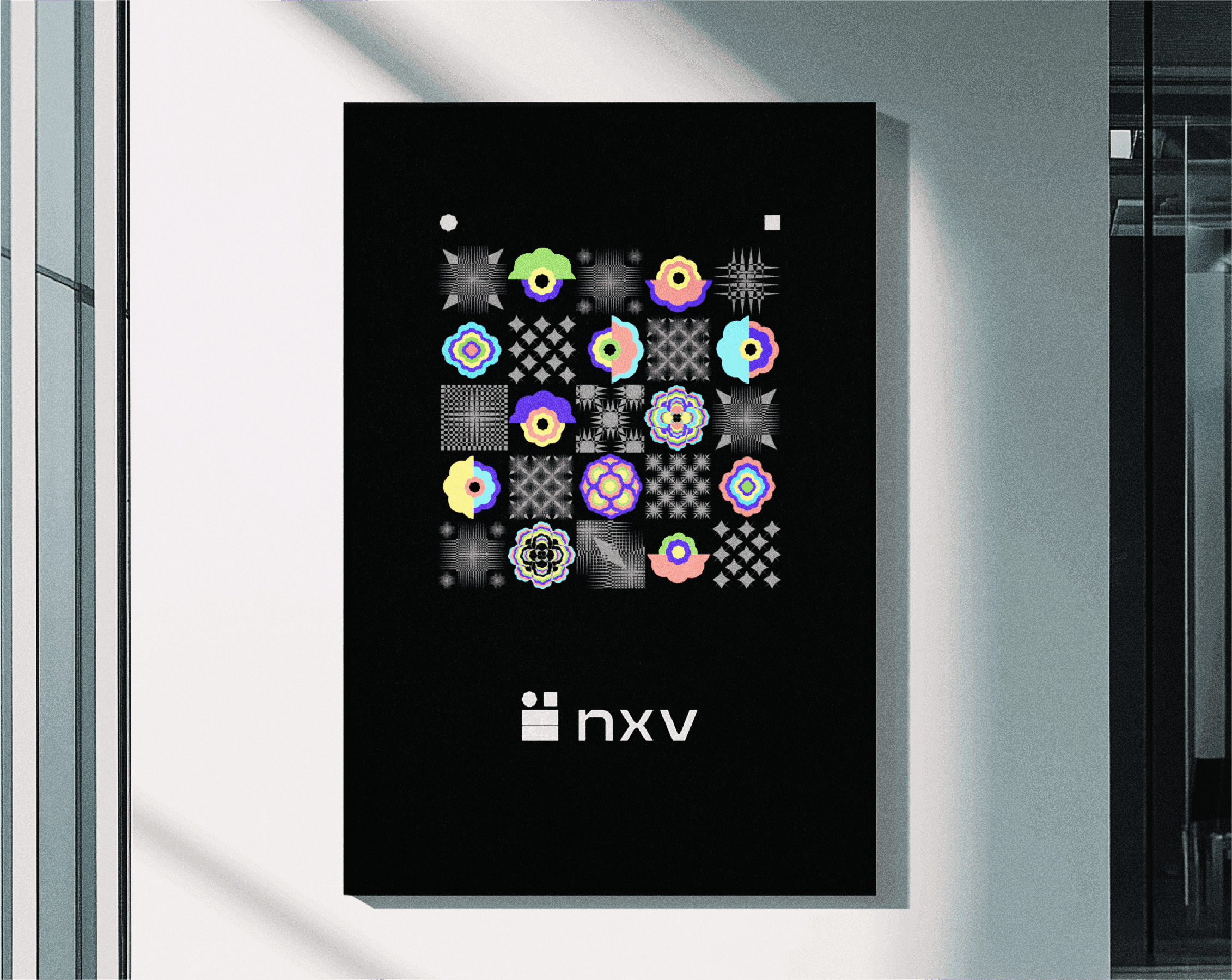
Watch circles and squares multiply into mesmerising patterns. Each arrangement whispers the same secret, we're better together. Mathematical precision meets artistic intuition, creating brand elements that feel both engineered and alive.